
A house in Mallorca, three decades on…
‘The landscape lining the highway out of Palma becomes wilder and dustier as we head south. The client driving us — a native Mallorcan who grew up here — observes that he has only been down this road half a dozen times in his life. As a businessman who travels extensively within the island as well as globally, this seems a significant admission, especially since we are only ten or fifteen miles outside the capital. Beyond the billboards and hoardings, the red earth is littered with small houses and groves of tangled olive and almond trees, rising to a line of rough ridges on the horizon.
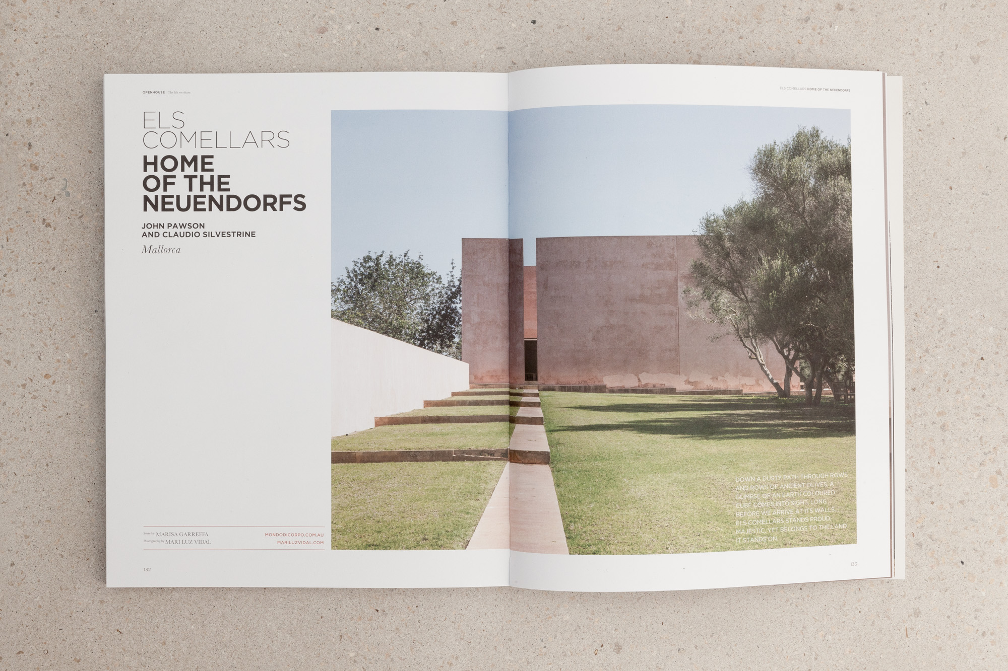
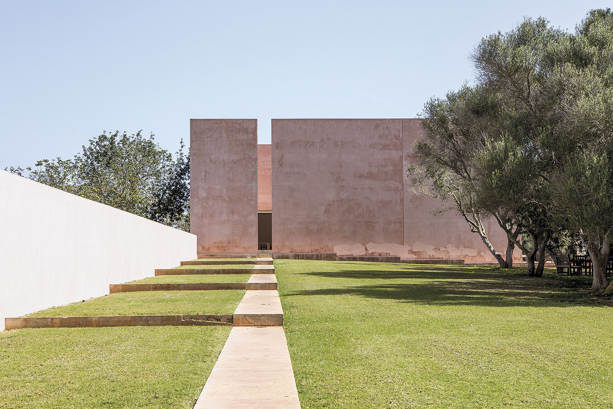
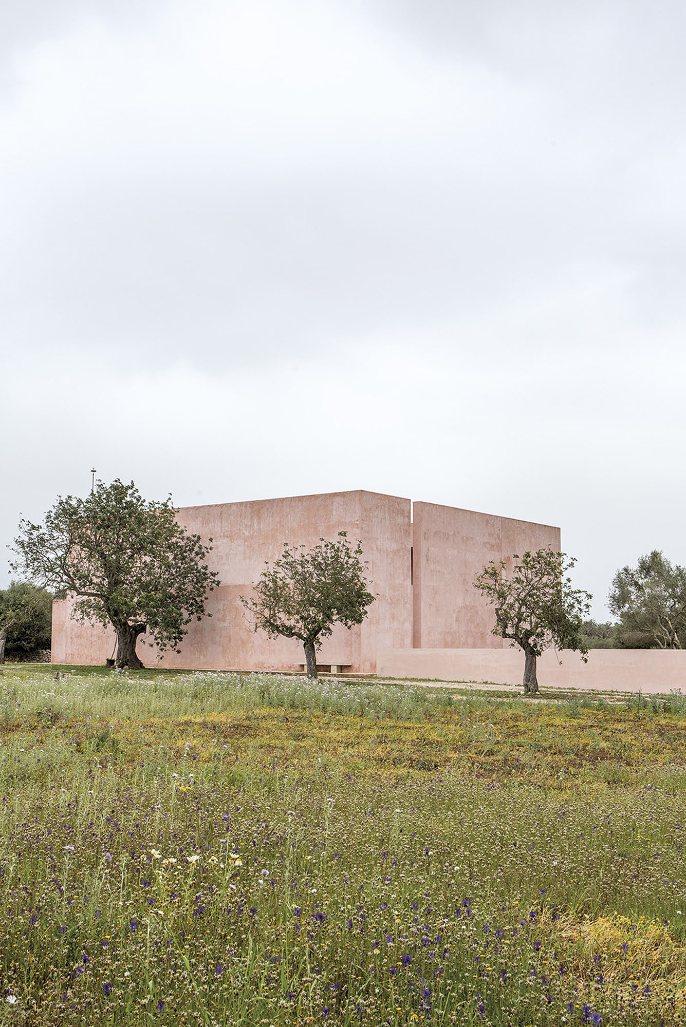
We have arranged to meet the German housekeeper at the Santanyi petrol station — apparently it is easy to get lost, as did Claudio Silvestrin, the other author of the project, bringing members of his office on a study trip a few years ago. Following the housekeeper’s car, we leave the main road and wind along a narrow track, passing the entrances to other houses. Finally the ochre volume, familiar from so many photographs, appears on the crown of a low hill. We park outside the main house and walk back down the slope in order to approach as the architects intended.
The attenuation is astonishing. To the right is the tennis court, located in a vast excavation, its surface the same brilliant orange as its walls. Entry involves a theatrical descent between narrow walls, past a basin set in a full-height groove. With each successive step, the acoustic tightens. This is the first of a series of finely calibrated experiences of enclosure and compression that are all the more powerful given the vast, undomesticated landscape that is the house’s context.
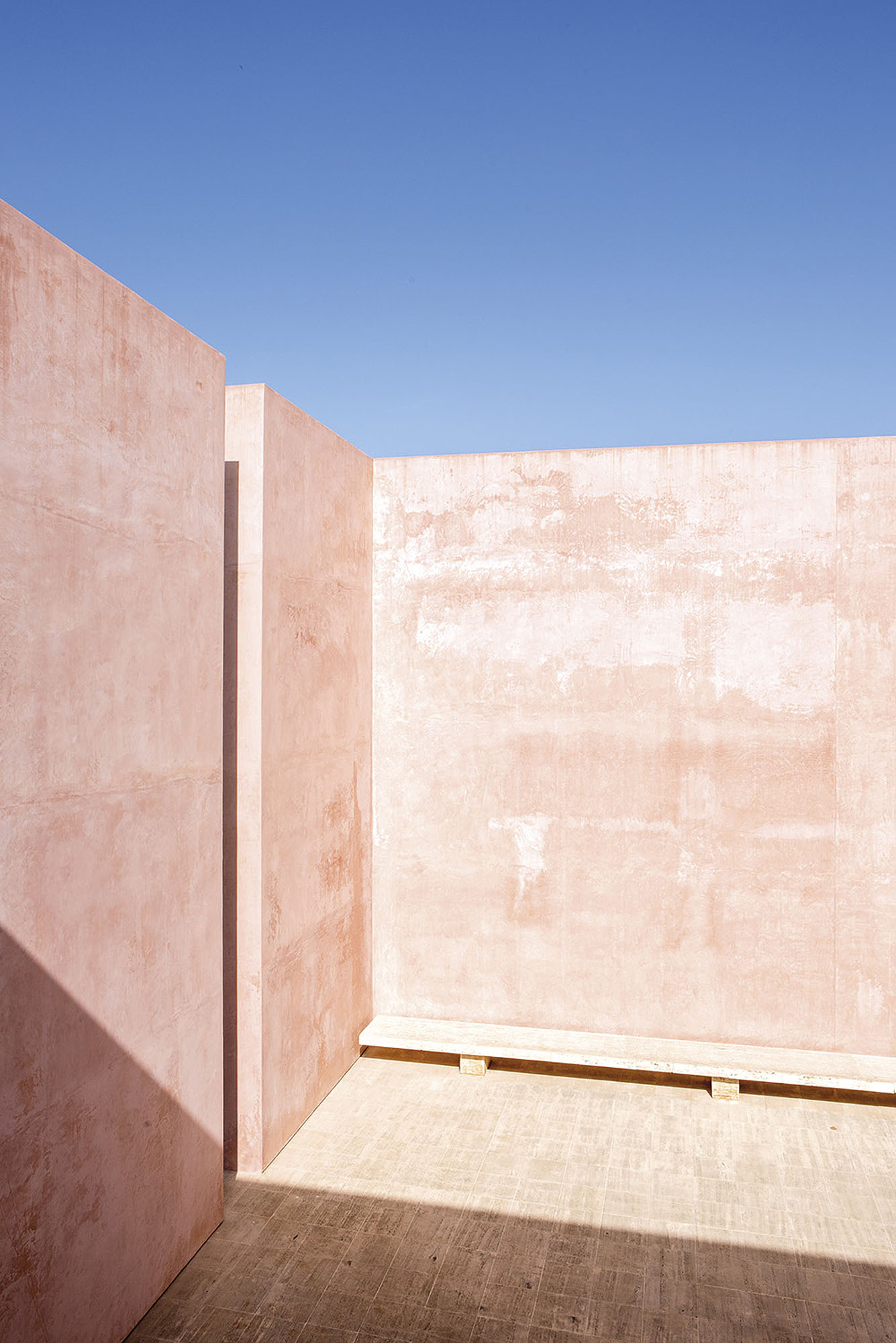
We continue up to the house, entering via the iconic courtyard. The composition is emphatically vertical and achieves a quality of proportion in outside space more usually associated with interiors. The exaggerated height of the walls is dramatised by the narrow slot whose edges make the thickness of the mass legible. A modest countering horizontal is added in the form of a bench, set low to the ground. The contrast between unmediated space and the world within the walls is underlined by the glimpsed view of sky and landscape through the gap. Every gesture is read more acutely because there are so few.
As the design brings together certain conventions of interior and exterior spaces, so it plays with the opposition of raw nature and the formality of architecture. This goes further than simply sourcing local limestone for the bench. Pigments from the soil have been used to colour the render. The resulting intense reddish orange hues mean that the blue of the sky — and thus the duality of earth and sky — acquires a startling intensity. Much of the wall surface here is new and the effect of the smooth, subtly modulating tints is both visually spectacular and compellingly tactile. After the melancholy images on the office server, taken when John visited the place with Calvin Klein one grey November afternoon a few years back, I was not expecting this fresh exuberance.
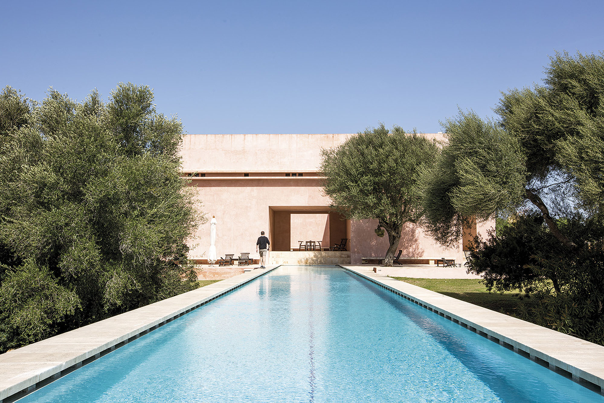
A large, regular opening from the courtyard leads into a semi-enclosed living area overlooking the pool: an attenuated tongue of water projecting out into the landscape. Today the sky is the same impossibly brilliant tint as the azure water. The geometry inexorably pulls one along the stone slabs to the far end, with its full-storey drop to the children’s splash pool and waterfall below. The steps that run to the side of the main pool are framed to one side by smooth earth-tinted render and to the other by rough stones and mortar — another articulation of the subtle gradations of architectural control. All around are the trees typical of the area, whose large withered pods look like so many dead blackbirds hanging from the branches.
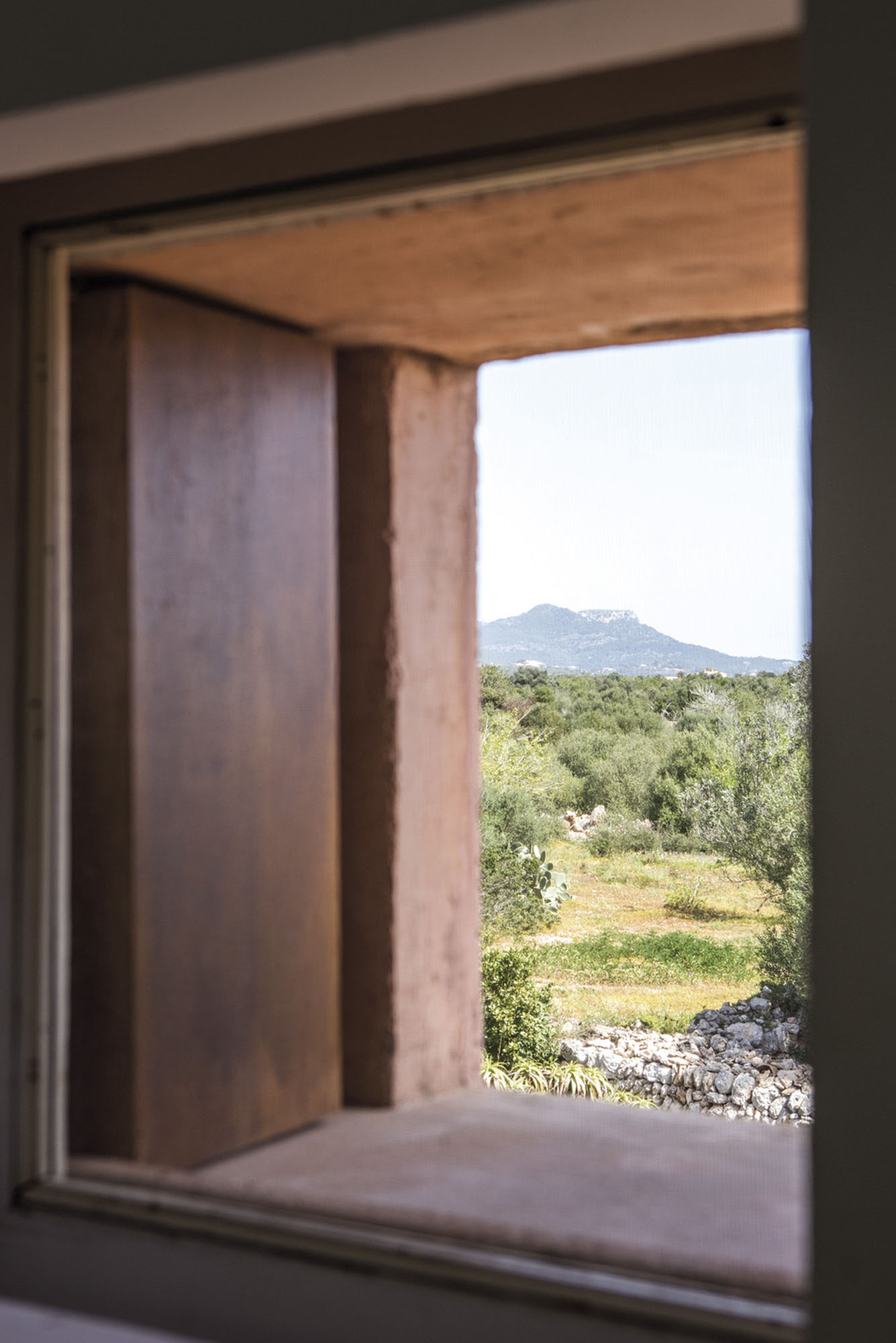
Climbing to the roof, one is reminded that the open terrain surrounding the house has no softness to it, instead the prospect has an exhilarating, elemental quality. One quickly appreciates the important role architecture plays in ‘placing’ its inhabitants in such a landscape. One appreciates, too, the achievement here of a design that provides the reassurance of enclosure without a loss of scale and that draws frames which allow the viewer to see more clearly, rather than simply to see less.’


Words by Alison Morris
Photography
Mari Luz Vidal
Cover and spread photography
Max Gleeson